These are a few of the highlights in Part 1 of our 3-Part Webinar Series on Microsoft Excel: Learn to Use Excel Like a Pro.
As part of the Microsoft Office suite of application software, Excel is an electronic spreadsheet (worksheet) program that is used to store, organize, and perform calculations with data. This data can be in the form of dates, text, numbers, and mathematical operations and is entered in the core component of Excel, which is a cell. The Excel interface has over 16,000 columns and over 1 million rows in which to input data and one cell can contain over 32,000 characters. Performing calculations in Excel is only the tip of the iceberg – Excel is also used to chart or graph data to make it easy to identify trends visually.
The best part about Excel is that it can apply to many business tasks, including statistics, finance, data management, forecasting, analysis, inventory, billing, and business intelligence. People who generally work with financial information such as accountants and accounts receivable personnel rely on Excel because of its capability to quickly perform mathematical operations and painlessly solve problems that involve tedious computations. However, most anyone can find a use for Excel, with its one-click functions and tools, ranging from preparing a simple household budget to more complex projects.
When working in Excel, you will hear the words "formula" and "function" used frequently, sometimes interchangeably, in regard to performing calculations. They are closely related - but not exactly the same. Technically, a formula is any mathematical expression that begins with an equal sign (=). A function, on the other hand, is a pre-built formula with a special name and purpose, such as Sum or Average.
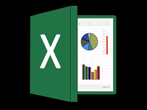
If a picture is worth a thousand words, in Excel a picture (in the form of a chart or graph) is worth a thousand numbers! One of the most exciting features of Excel is its capability to present data visually by offering a variety of chart types such as bar and pie charts. Charts help you visualize your information so that you can analyze it more effectively as well as see how it is trending.
To make managing and analyzing a group of related data easier, you can turn a range of cells into an Excel table. Tables make it easy to sort, filter, and format data as well as provide colorful banded effects for creative reporting.
Over its many version releases, Excel continues to offer ways for its users to be more productive in less time by adding new tools that intuitively make your job easier. One of these tools to become acquainted with is Quick Analysis. The Quick Analysis tool helps you quickly format your data, create a chart, design a table, or include a summary formula – simply by highlighting a range of cells!
This and a lot more was covered in our Learn to Use Excel Like a Pro webinar. Stay tuned for our Excel Part 2 webinar as we continue our Excel learning series.

